The Google Ngram Viewer, started in December 2010, is an online search engine that returns the yearly relative frequency of a set of words, found in a selected printed sources, called corpus of books, between 1500 and 2016 (many language available). More specifically, it returns the relative frequency of the yearly ngram (continuous set of n words. For example, I is a 1-gram and I am is a 2-grams). This means that if you search for one word (called unigram), you get the percentage of this word to all the other word found in the corpus of books for a certain year. When I discovered it, I was shocked! With google ngram one can plot the yearly relative frequency of any ngram! The Google Ngram Viewer help page contains a lot of very convincing examples. It is the perfect typical data mining tool. I started to imagine what I could do with such a tool. One can study trends in knowledge, one can study relative importance of concepts etc …
A science paper has been published in 2011. They named this research field as culturomics. This paper presents some convincing search examples, which put the culturomics in front of the scientific literature. This research field has popping up in social science articles and made the Google ngrams charts very common and popular. This Google’ service have received many criticisms. A PLOS paper discuss the pitfalls of Google ngrams. Mainly inaccurate character recognition, an overabundance of scientific literature, misindexation and misdating of texts. Up to that point, I though that this was manageable. Indeed, inaccuracies will be soon corrected and Google will incorporate other books then this will not be a problem. Last criticism is that the percentage take into account published manuscripts regardless of their importance. Again this paper discuss from in a very convincing way the limitations of Google ngram.
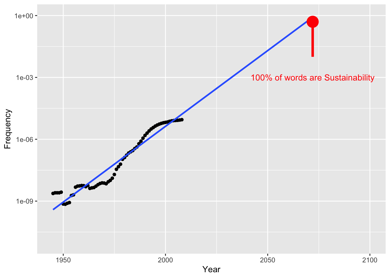
We definitely need an R package to test it. Hopefully, it exists ngramr, an r package available on github. It is very efficient and easy to use. Then let us start with our first search (an inspired joke by xkcd actually).
require(devtools)
library(ngramr)

data<-ngrami(c("sustainability"))

library(ggplot2)
data.sub<-subset(data,data$Year>1985)

p<- ggplot(data,aes(x = Year, y=Frequency))+
  geom_point()+
  stat_smooth(method = "lm", se = FALSE,data=data, fullrange = TRUE)+
  scale_y_log10(limits=c(0.00000000001,1))+
  xlim(1945,2100)+
  annotate("pointrange", x = 2072, y = 0.5, ymin = 0.01, ymax = 0.8,
           colour = "red", size = 1.5)+
  annotate("text", x = 2072, y = 0.001, label = "100% of words are Sustainability",colour="red")
Which produces this graph. Fast and easy! As one can see, on a log scale Google ngram predicts that in a near future all published literature will be made of the word “Sustainability” written over and over …